Mala Chetty
We were allowed to give this beautiful Dutch brand a completely new look.
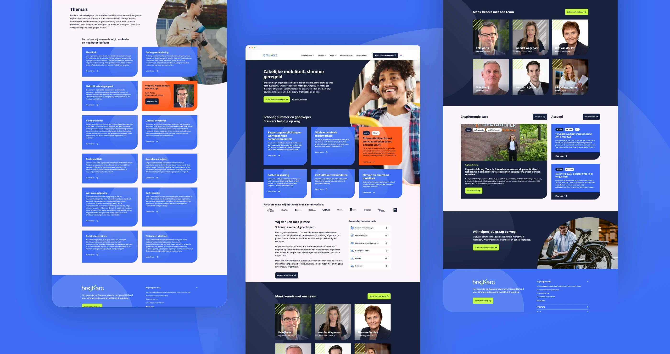
Breikers' existing website was in need of an upgrade. The structure and content were fragmented, and the visual style and navigation were outdated and did not offer enough guidance for different target groups. The challenge lay in logically building and structuring the large amount of information on the website.
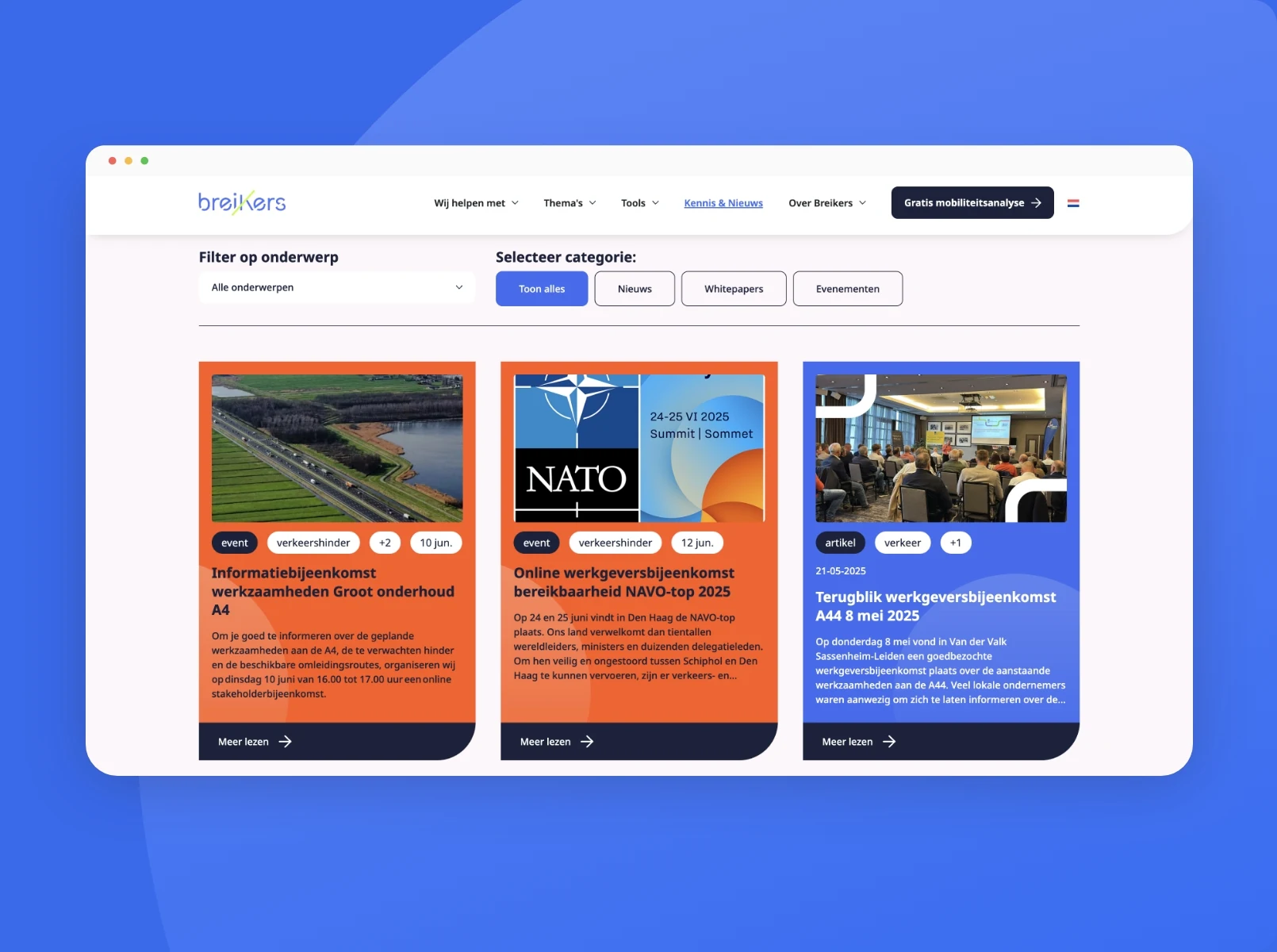
The new site would be divided into themes. These themes recur throughout the site. For the development team, the challenge was to automatically link the themes to all news articles, services, events and other content. So that these are also automatically reflected on the theme pages.
Look at the website
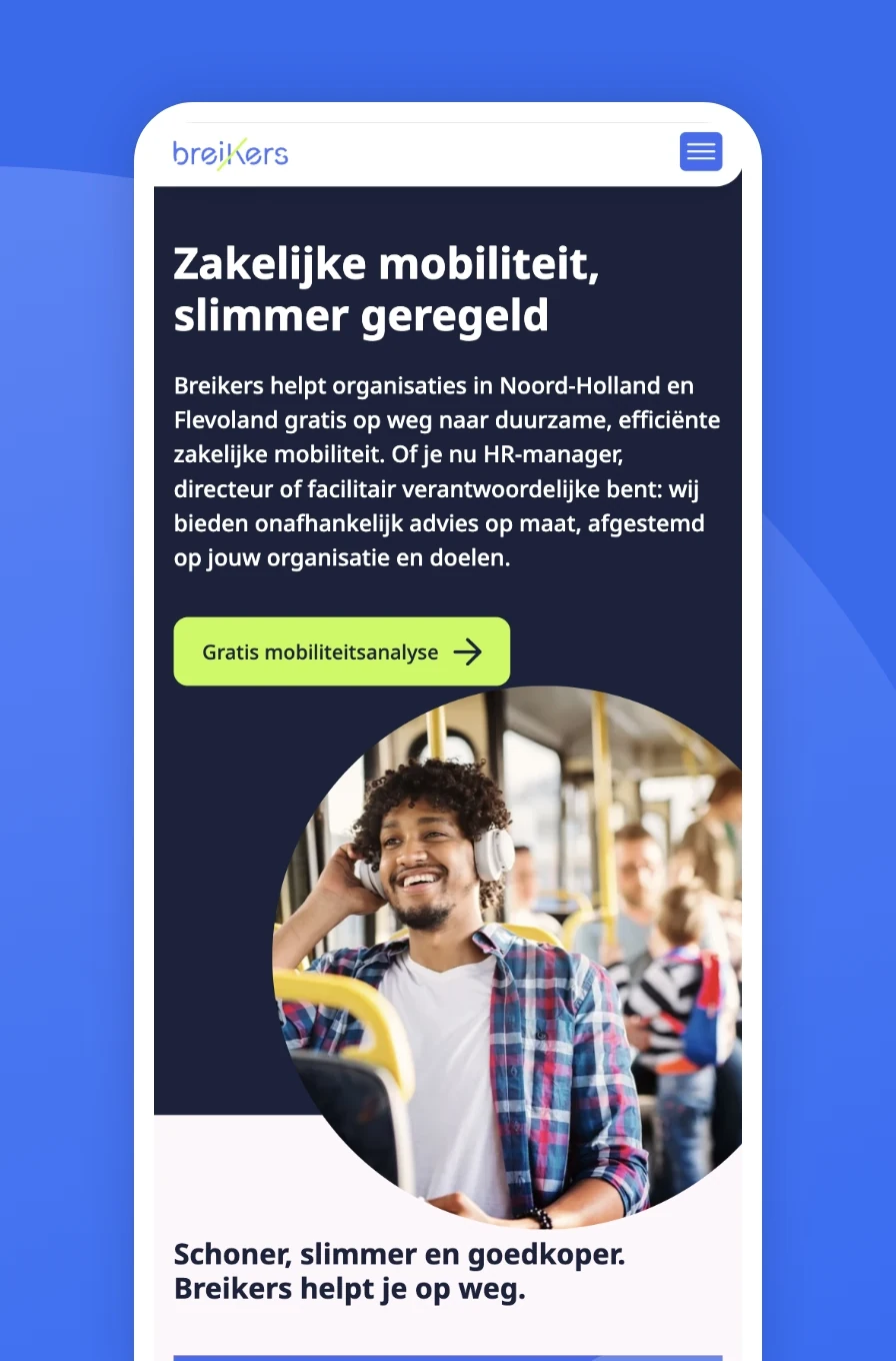
We started with a thorough analysis of the existing website. Based on that, we designed a new sitemap and information architecture that put users at the centre. We refreshed the visual style: accessible, intuitive and human.
When developing the site, we started with the structure of all 8 content types Breikers has on the site. These content types are all linked to each other so that in the site's backend, it is easy to choose which articles or white papers recur on the tools, themes and services pages.
Only when this structure was completely watertight did we translate the design pixel-precise into code to get the result we have now.
"Lekker snel, efficiënt, goeie energie, en ook nog een top resultaat"
""

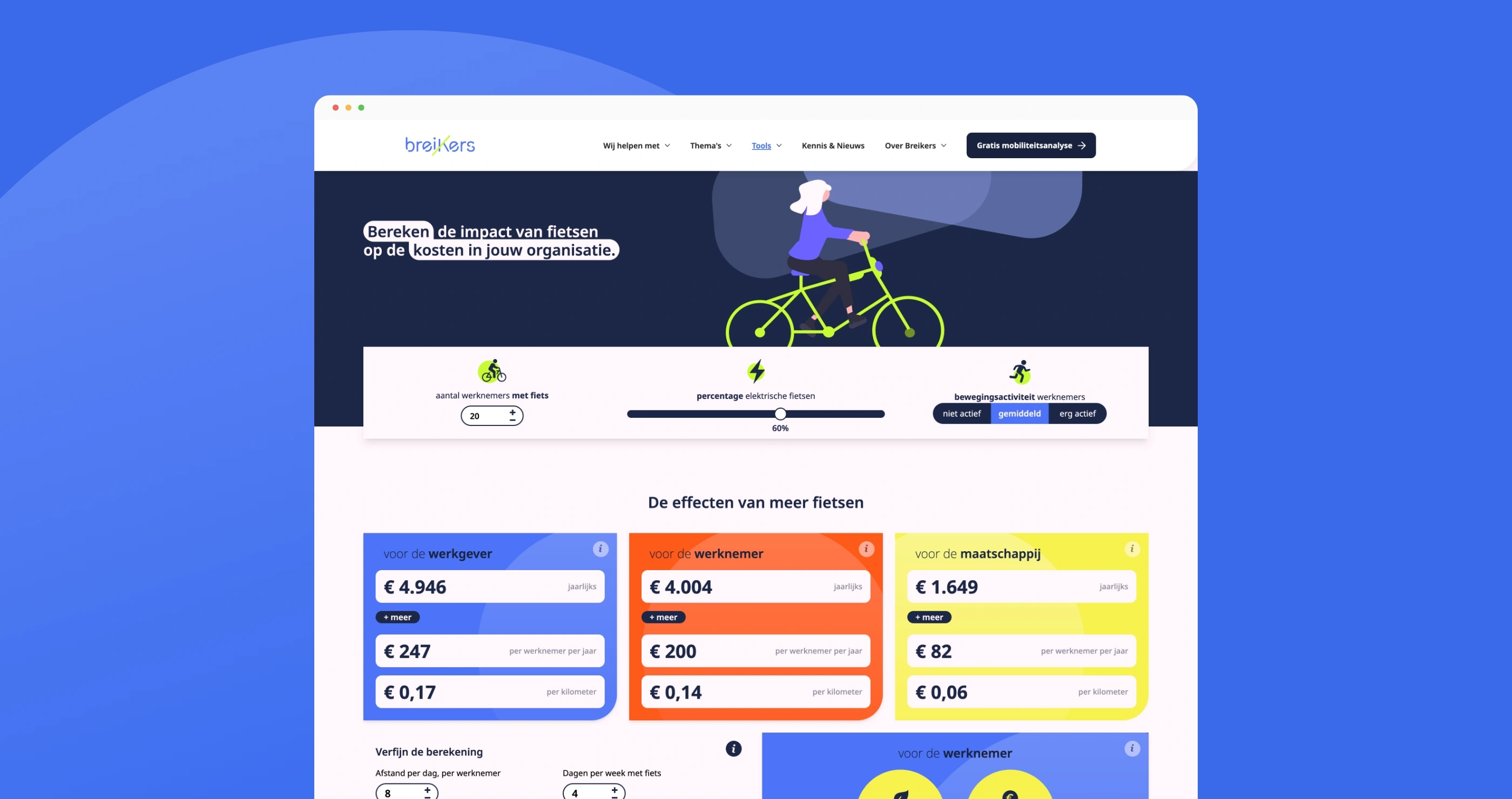
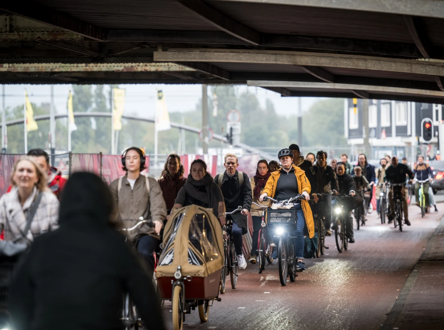
The revamped Breikers website is clear and purposeful. Users find the information that suits them faster. Breikers offers different routes to sustainable mobility: from scans, advisory paths and inspiring practical examples. All these options deserved a logical place within the website.
The new site is also super-fast and the ease of use in adding new content such as news articles has been greatly improved. Both us and Breikers are very proud of this beautiful website that will last for years to come.
Let’s see what we can do for you during an initial meeting!